Although fish are likely the most low-maintenance of pets, this does not mean that owning a fish tank comes without its challenges and responsibilities. There are many things that fish owners have to keep in mind. How's the temperature of the water? How's the pH level? Are my fish getting sick? Without proper care and attention, pet fish can actually become sick (and die) just weeks after purchase.
All of these concerns make taking care of a fish tank a lot more work than some may expect. Especially for those who purchase fish tanks mainly for their calming effects and decorative value, people should be able to take good care of their fish tanks without having to stress over maintenance or fish health. We set out to help those people with Upstream.
To gather a better understanding of the fish tank owning space, my team and I interviewed fish tank owners and spoke with an aquatic specialist at PetCo. Below are our main findings from speaking with these people:
With support from our initial research, we wanted to create an app that would simplify the tank maintenance process and ensure that our users' fish are healthy. We came up with the following features:
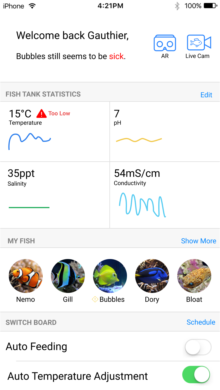
Our first prototype allowed us to gather some feedback on our app's usefulness to fish owners as well as its overall usability and appeal. We asked our testers to complete three tasks:
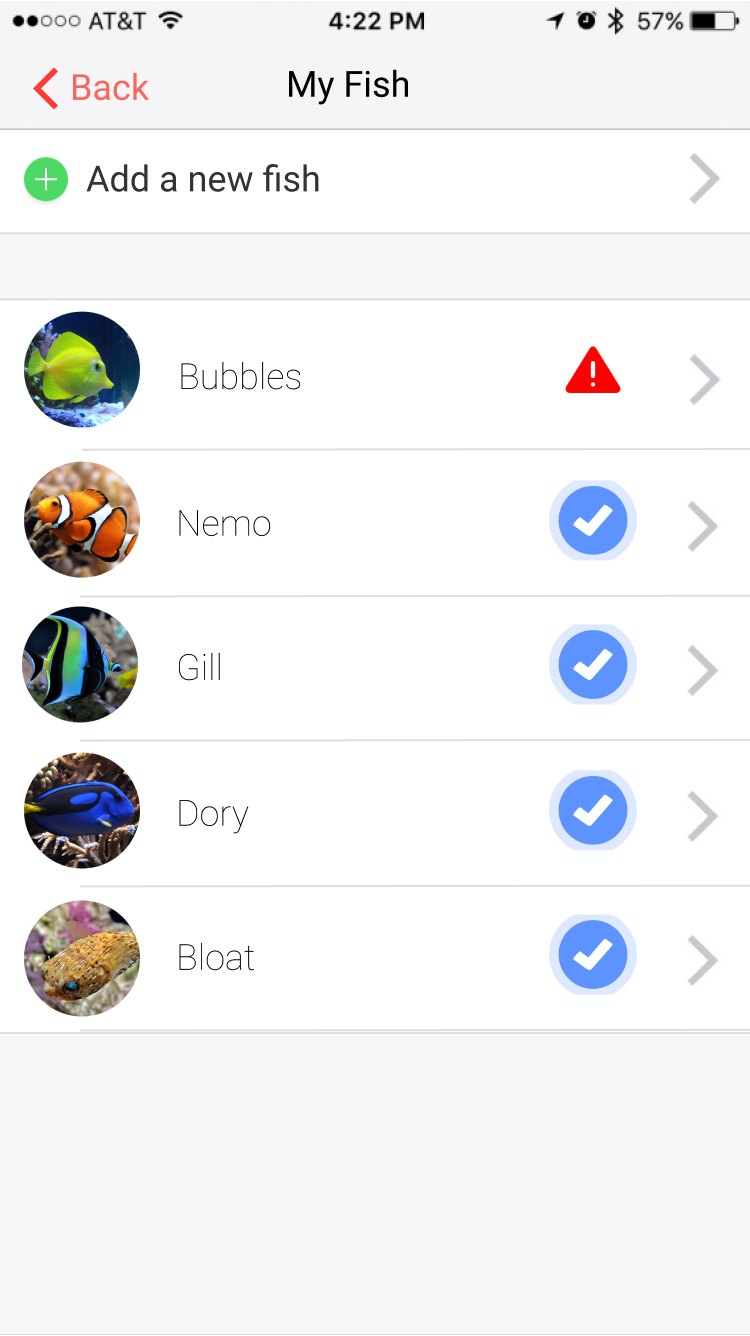
From testing this iteration, we found that users enjoyed the idea of scheduling feedings and being able to keep track of their fish. However, we discovered some major navigation issues, as our testers had difficulty navigating to different parts of the app when asked to complete a new ask.
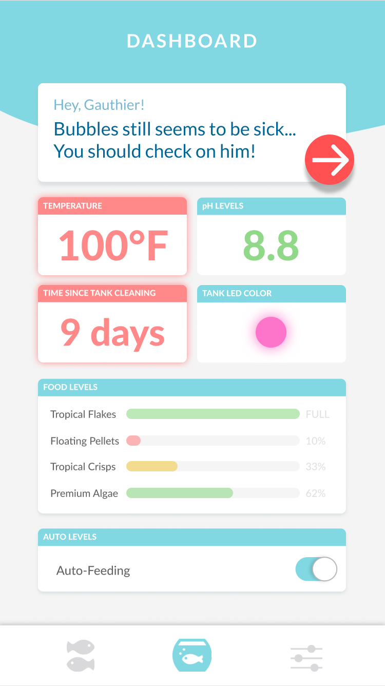
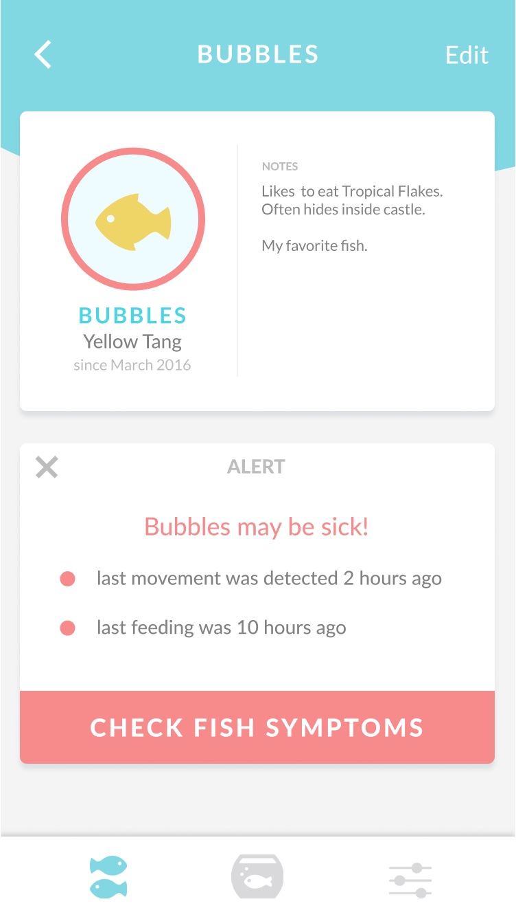
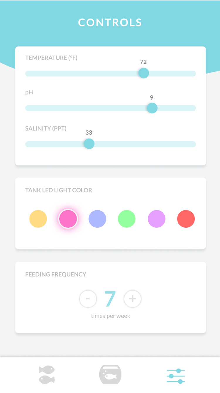
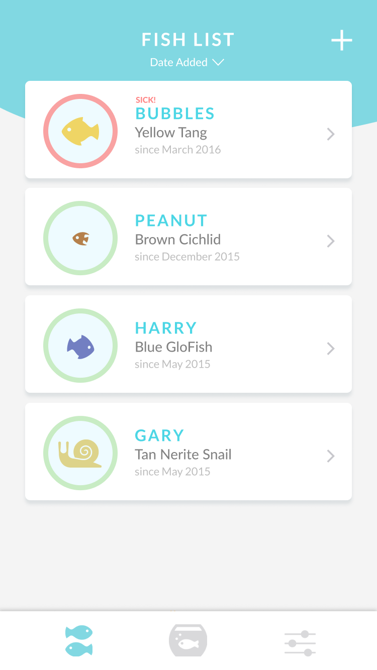
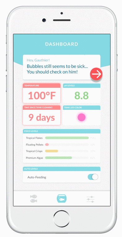
With our second iteration, our goals were to improve navigation and to give the app a visual facelift. To better segment the different aspects of our app, we implemented a bottom navigation bar to allow the user to quickly switch between discrete tasks. We also added character to our application by appying a defined color scheme and unified graphic elements.
Note: The entire team participated in research, ideation, testing, and discussion. The mockups from the first iteration were created by another member of my team. I designed the second iteration, using testing results and feedback gathered by my team.